Photographers
Forced Perspective Photography


Forced Photography is when you can manipulate an image physically or in post production to make an illusion. You can make something very small very large, for example placing a human next to Big Ben, but making Big Ben small and the human large.
Minimalist Photography


Minimalist Photography allows you to take something simple to the extreme but still keep it simple. Its contempered, but also looking at perspectives. It to me shows a different way of looking at the work, rather than a straight on photograph.
Minh T (THISMINTYMOMEMT)
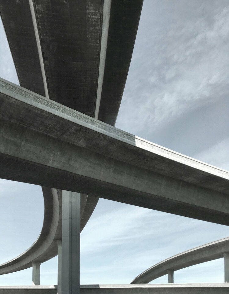
I like the way Minh uses a low angle shot in the image on the right. I think adding a low angle to the already brilliant shot of the overpass, really brought out the scale and shows its 3D. The grey of the sky and the grey of the concrete/stone work well together, I don't think they cancel each other out, I think it actually works in Minh's favour.
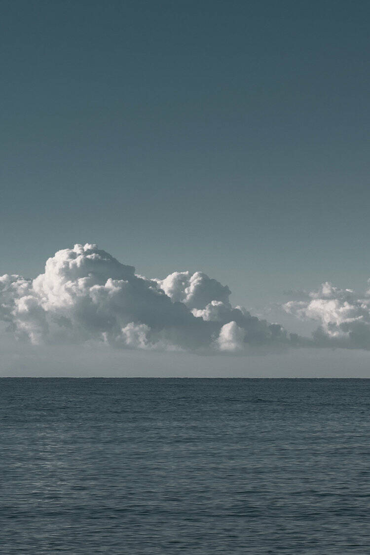
The image to the left however, tells a different story. I like the way the brooding clouds are in contrast with the dark and gloomy water. Both halves of the image seem gloomy however, the sea seems more angry opposed to the clouds which have hints of light in them. Most of the time when we see images of the sea they are landscapes, by shooting this portrait it shows you less,
Oliver Morisse
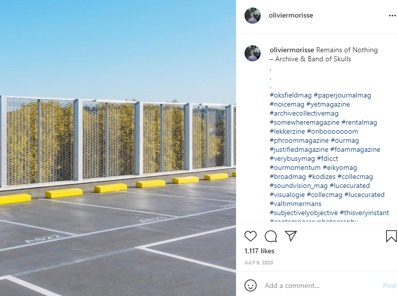
Morisse's work really spoke to me in the sense of lines, shapes and colour. He has a good use of colour and parallel lines. His work looks at the landscape from an angle I tend to see it through. The yellow in the left image contrasts well with the blue sky and grey/white tarmac. Looking at the left image, you know its got to be a car park, but where is it, what level. It looks as though the green behind the fence could be the tops of trees which suggest its not ground level, but up higher, whether that be on a slope or in a multi-storey car park. I would like to apply this to my own work and keep my viewers guessing.
Johan Kson

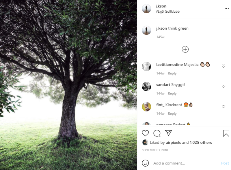
In my series I would like to have different types of shots of the landscape, up close, long shot, low angle, high angle etc. Kson's work is similar in that sense. His work incorporates abstract pieces as well as naturalistic. His shots are simple yet effective and creative. The one on the left intrigues me the most because it stands out in the most simplistic way, he hasn't cluttered the image with say a tractor or a car.
However the image on the right does come across slightly underexposed to me. I think just a little more colour would make the branches more highlighted.
Michael McILvaney
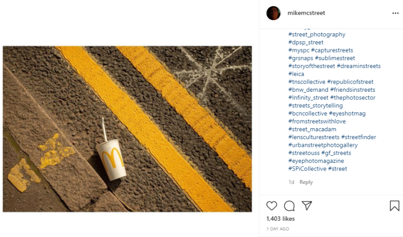
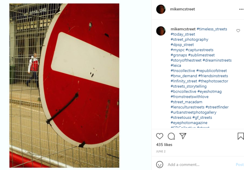
I think some of McILvaney's work is really creative, he works with the landscape, opposed to creating it. The M on the McDonald's cup ties in nicely with the double yellow lines, where as the white of the cup goes well with the star marking. In the image on the right the red of the stop sign works well with the persons body of the coat and the white line through the middle works well with the persons sleeves. McILvaney either creates or waits for that perfect moment to get a shot that work well. This has been influential for me in terms of spending more time creating my images and maybe bringing items along with me to help create my images and slightly change the landscape.
Create Your Own Website With Webador