All things BOOK!
002 - Initial Planning and Research
Book Layouts
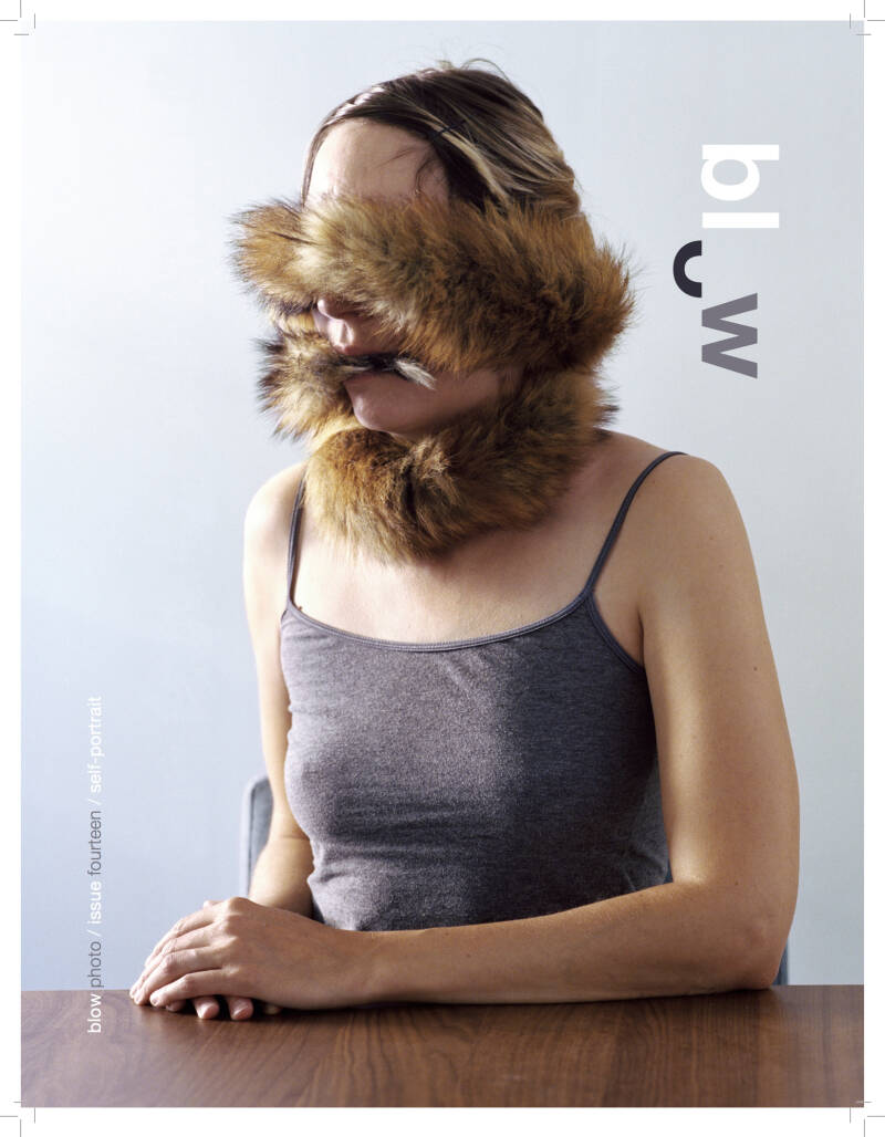
Book Layout Inspiration 1 - Feature in Blow, Issue 14, Self-Portrait - Anna Fawcus

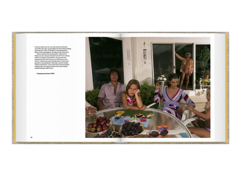
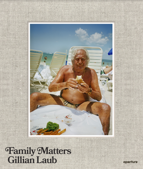
Book Layout Inspiration 2 - Family Matters - Gillian Laub
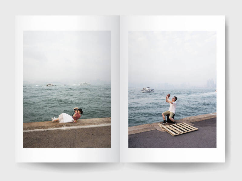
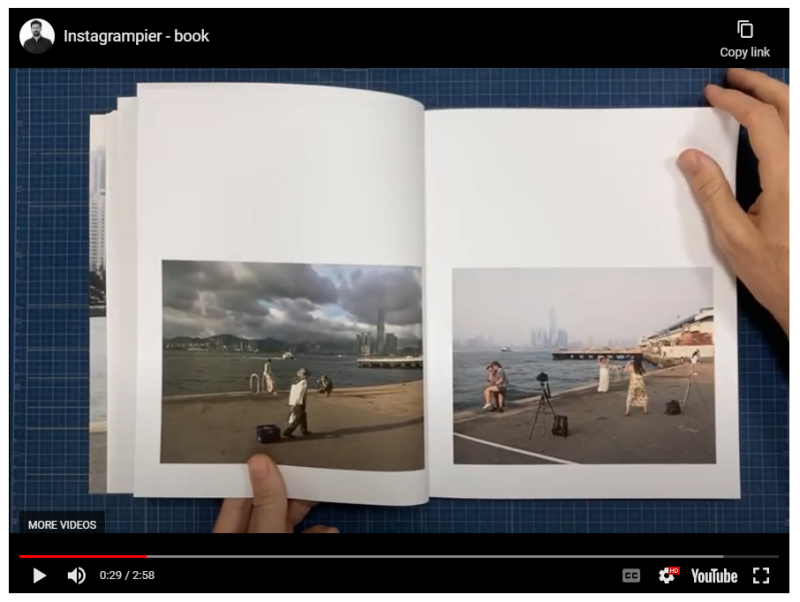
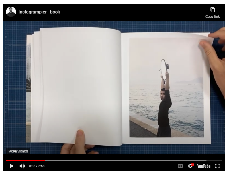
Book Layout Inspiration 3 - Instagrampier Book - Pierfrancesco Celada

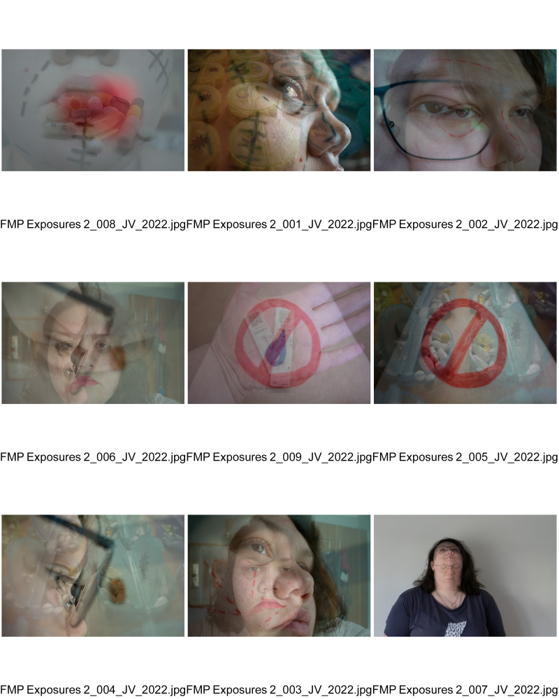
I was on Lens Culture looking through books to find interest and ideas and I came across Anna Fawcus' Feature in Blow. The image to the left immediately spoke to me. It reminded me of a previous project where I shot 35mm film and used the exposures creatively by rubbing faces out, cutting faces out and coloring them in in black sharpie. In this project I was trying to narrate a personal sense of loss for my mother. This image reminded me of this and gave me another idea of how to physically manipulate my own images.
Gillian Laubs book family matters was another layout that spoke to me. It was a layout that I had seen previously used when researching for Reflections On The Real, however I wasn't sure I liked the style. However the more I see it the more I like the layout and would like to give it a go within my own book.
Pierfrancesco Celada's book stood out to me also because of his layouts. He has kept his boarders consistent throughout other that his fillers and has a couple select images sizes and orientations that work very well together as a body of work within a book. Not the work itself although it is very good but the layouts have intrigued me. I would like to look at similar layouts and have a play around with layouts similar to these once I have a few more images to play around with.
001 - Major Body of Work
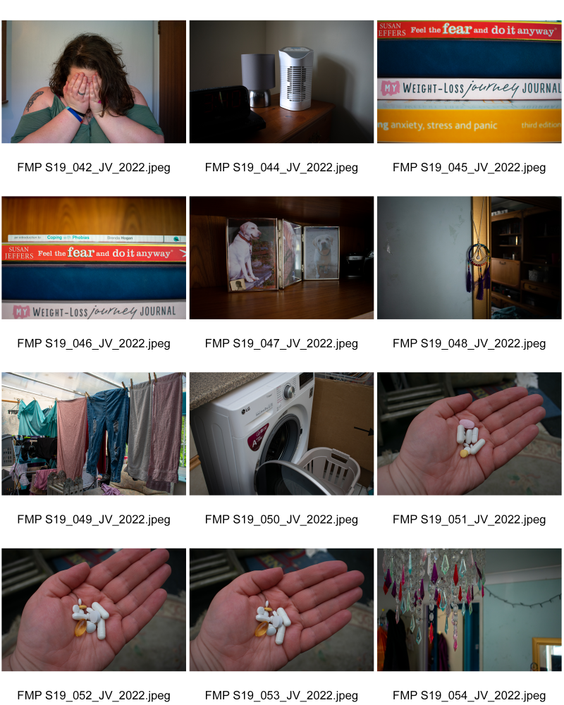
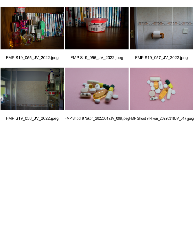
Behind Closed Doors - Edit One
Shot on Sony A7 ii, Nikon D3400 and Samsung Galaxy S10
Behind Closed Doors - Edit Two


Behind Closed Doors - Edit Three
Behind Closed Doors - Edit Four
Behind Closed Doors - Edit Five

Behind Closed Doors - Edit Six
Bokeh Bella's - Facebook Communication
Behind Closed Doors - FINAL EDIT
I had to shoot this a few time because I couldn't get the focal depth quite right and the book kept moving so I decided to use my yoga mat as it is non slip which stopped the book from moving as i flipped through it and it made for a well lit background as i shot this by the window which brings in a lot of day light which was cloudy.
I decided to speed this up in premier pro to 375% and to unlink the audio and delete it.
Behind Closed Doors Final Book Evaluation
Overall, I am very happy with the final product. For this project I decided to get an image wrap instead of a dusk jacket which I am much more please with because the dust jacket got on my nerves before and I found it got damaged too easily. Last time for reflections I also decided against putting any text on my front cover as it worked better for me like that, however I wasn’t as happy when the book came and over time I now wish I had put my title on the cover. So in regard to this I decided that this time I was going to put the title on the front page. I am much happier with my font and text size this time. I selected ‘Georgia’ and size 16. For my reflections book my font was 24pt which didn’t look all too big on the screen but when it came in the post it was massive and it looked awful. So I was very careful in selecting my font size, I think I could of got away with one or two sizes even small but 16 is a comfortable reading size.
I chose to have my front cover text white because black text didn’t work on my hair as I am a brunette so I would have lost the word doors. White text works well and I would use it again in a similar situation. This time after many layouts that I have unfortunately lost when I was sorting my hard drive out I decided to use two of Bookwrights layouts as I was looking further into the software settings and discovered it. I thought I would try it out and I really liked the size, it worked nicely. I decided that I didn’t want all of my images the same size as that is a bit boring and I wanted one to two middle eight’s. So I decided to not over complicate it and go for two different sizes, left to right (blank – big, blank – big, blank – smaller and repeat other than the middle eight’s).
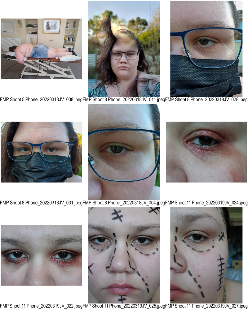
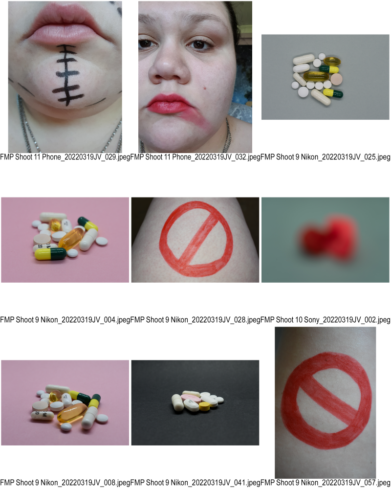
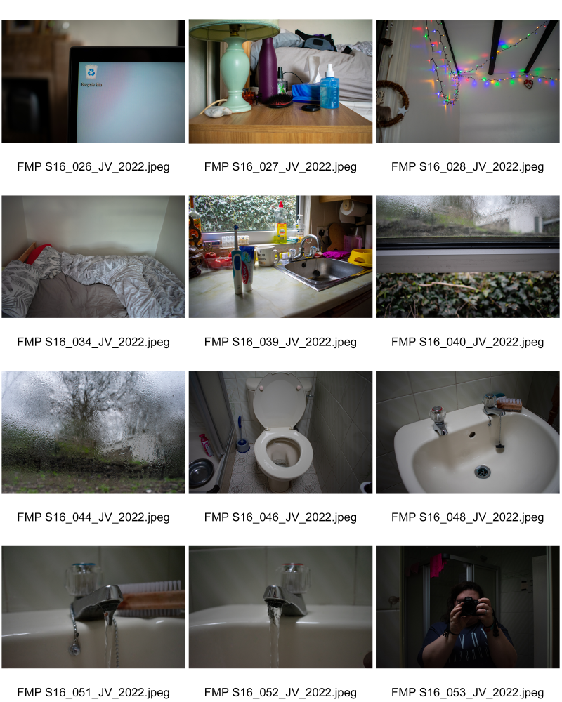
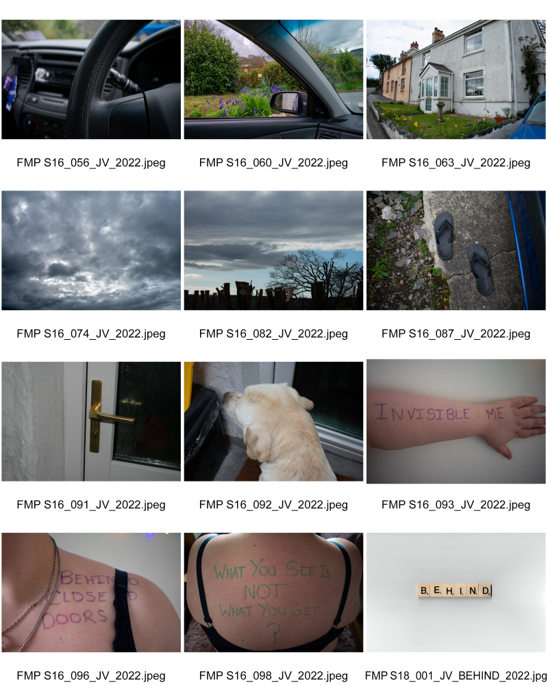
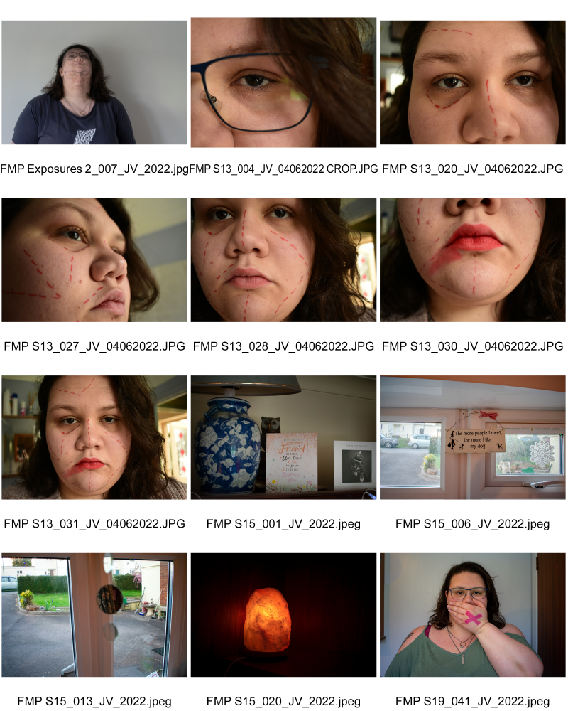
After speaking with Paul and Andy we decided not to have my portraits all the way through as I wanted to convey invisibleness and to focus more on space and emptiness. So for this reason there I only a couple of portraits throughout. However I think next time I would like to experiment with lots of portraits as well as adding in more body handwriting as this adds more depth and personalization. As well as conveying invisibleness I also wanted to lay my day to day life to show it can almost look normal, like other peoples, although I don’t think there is a normal out there. The image of the recycle bin was one of my favorites for its simplicity. Some of my peers didn’t get it but Andy got it straight away. My life is not great at all from the fibromyalgia side of things and it makes me feel like rubbish and I thought this was a brilliant way to say this.
I chose to add a border to my images this time, a very think black border to outline my images and to give them more purpose. I also decided to only have left pages for my middle eight’s as the left pages are weaker and I think none of my images are particularly weak but there are definitely stronger ones. I chose to add an image of myself to the back and a quote because it looked more auto-biographical which is what you find on most autobiographies, not necessarily all on the back though. Some at the front inside and some at the back inside. Overall I am really happy with my book and how it looks.
I have chosen a book as my planned output with the addition of an 3 or 4 A2 images alongside. I will decide on either 3 or 4 on the day when I see the space. As much as I enjoy seeing my work framed and mounted, I’ve never enjoyed going to galleries as much as I like looking through photobooks so for me, I have sided with personal preference.
Create Your Own Website With Webador