Photographers/ Artists / Books
- Marc Cohen
- Paul Graham
- Arielle Bobb-Willis
- Krass Clement
- Tobias Zelony
- Annie Leibovitz
- Louis Quail
- Dwayne Michaels
- Gabriel Isak
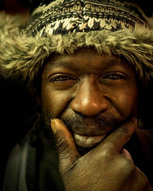
- Pogus Caesar
- Freud
- Robert Frank
- Daniel Regan
- Paddy Summerfield
- Jo Chuckuaalim
- Gilles Peress
- Jo Spence
- Nan Goldin
- John Mannell
- Edward Honaker
- Dana Lixenberg
- Mafalda Rakos
- Laura Hospes
Gabriel Isak - Mind State
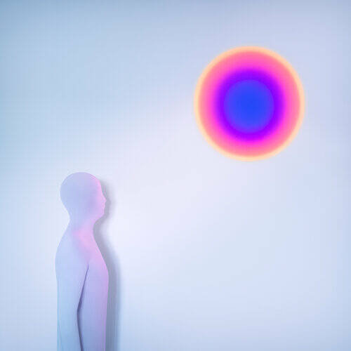
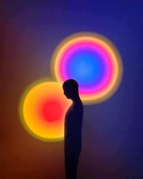
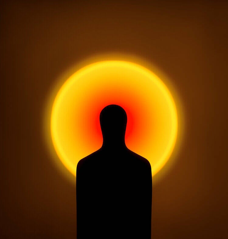
Whilst looking at Isak’s work I wasn't sure why I liked it but as I began to look through more of it, I really began to look in depth and feel his work. I understood what he was portraying, he has included a person without showing features or speech. By choosing to depict colour and body language speaks volumes about the photographer’s intent. By showing deep connection through body language and colour, by shooting people as silhouettes creates a simple yet raw image.
I took inspiration from this series because I wanted to connect my own viewer, I aspire to depict a deep connection within my own body of work. I wanted to produce a series that showed aesthetically pleasing images. Isak’s managed to draw his readers into an abstract world by creating very smooth but eye-catching images. These images quite clearly show the face the body and space but instead of focusing on detail the silhouettes create a story in correlation to the abstract colours used.
Daniel Regan - I Want Too Live

In Reagan’s images he uses space to show loneliness, emptiness, and invisibleness. By using various angles and heights he uses negative space to fit in the gaps, the thoughts, the void. this makes you look further into the image’s, looking in the foreground, background and deep into the story. This series tells the story of oh a life of emptiness and disguise without including people, however you can still see a human connection through man-made space.
Originally my project was going to being looking at invisible illness in Gloucestershire and how people live with their invisible illnesses. However due to contracting Covid-19, my project had to change due to time so I moved on from this idea as I could not leave the house and decided to document mine and my mothers time living with Covid-19. Covid-19 can be very visible but with myself and my mother it wasn’t that visible, aside from objects like masks and hand sanitiser. So, in relation to an invisible presence, I wanted to show negative space, similar to Daniel Regan’s work.
John Mannell - CALM (Campaign Against Living Miserably)
Mannell’s CALM series conveys lots of expression and texture. The raw emotion I the laddies face in the middle creates a very vivid picture of sadness and angst. Whereas the gentleman on the left is more comfortable and happier, he gives off a warmth. The girl to the left isn’t necessarily showing emotion, more of a blank expression. Is it just a pose or is there a deeper meaning? Mannell’s series is part of a suicide prevention campaign. Which is part of a bigger series, A picture a day for 365 days. He wanted to tie his imagery to mental health and showing how people suffer but also how they can be creative and express themselves. With each model he had a chat with them and asked their opinions of themselves and what they think others think of them and how they would like their portrait to depict them. The images have been created by model and photographer.
I found whilst shooting I would come back to this series. I wasn’t sure whether to get my mum to pose or act natural or a bit of both, but Mannell’s series helped me identify that I could do both. But also gave me an idea of the angles I wanted to use. However, unlike Mannell, I was stuck in a small bathroom with only a 28mm-77mm lens. So, I was lacking opportunity. If I could shoot again I would take out a higher mil lens and a macro lens to create more effective images within my series.
Jo Chuckualim - Men Don't Cry
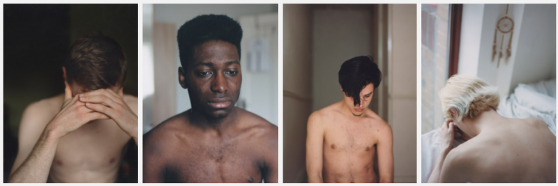
Chuckualims, Men don’t cry series is shot on 120 mm film, focusing on men and their mental health. The series depicts the raw, naked vulnerability of men which stereotypically isn’t shown often. Even though the whole face isn’t shown in all the images, you still have a strong understanding of a real person physically and emotionally. By shying away from the camera, they are concealing their emotion, however by doing that, it tells me that they are either shy or are hiding their emotions.
In my series I chose to make an image of my mother full bleed on the page. In the image she is concealed. Its more of an over the shoulder shot but you can mostly see her hair/head. The type of shot suggests there is more depth to the image, but its also about showing an unknowingness in my work. I want my viewers to look closer into the series, what does it really mean…?
Edward Honaker - Book II
‘A series which illustrates my experiences with depression and anxiety.’ This series caught my eye because of the artistic element to the series. The way Honaker has used different methods, digital and physical to manipulate his images to tell a story with extra emotion and depth. To demonstrate his feelings of depression, anxiety, and illness he manipulates his images by warping, post-production, and use of lighting. When looking at the images, you must look deeper to unravel the deeper meaning and he does that by adding multiple angles, faces and coverage such as water. By shooting his series as a black and white series it adds to the emotion and gives a little extra to the series delivery.
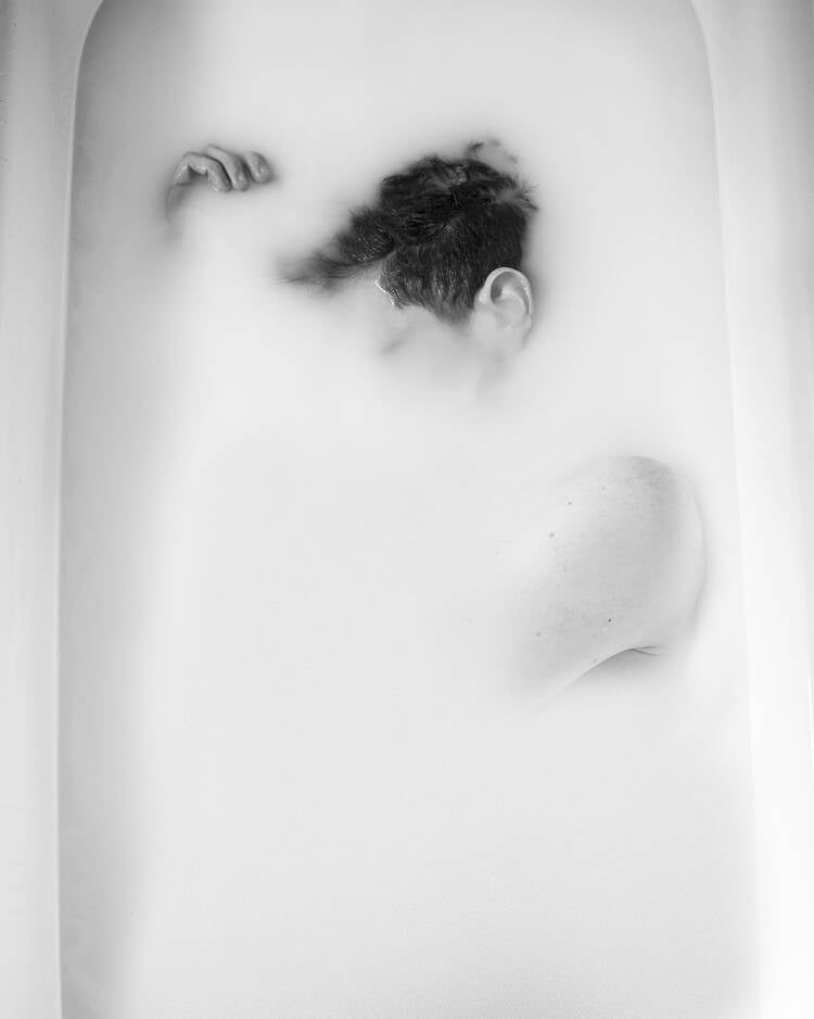
I wanted to incorporate Honaker’s work within my own with my own twist, however that was when my project was depicting myself and my mother living with Covid-19. So, Honaker’s project doesn’t apply as much to my current project, Deep Connection. However, I still took inspiration to shoot my mother in the bath which sprung my new project.
Mafalda Rakos - I Want To Disappear
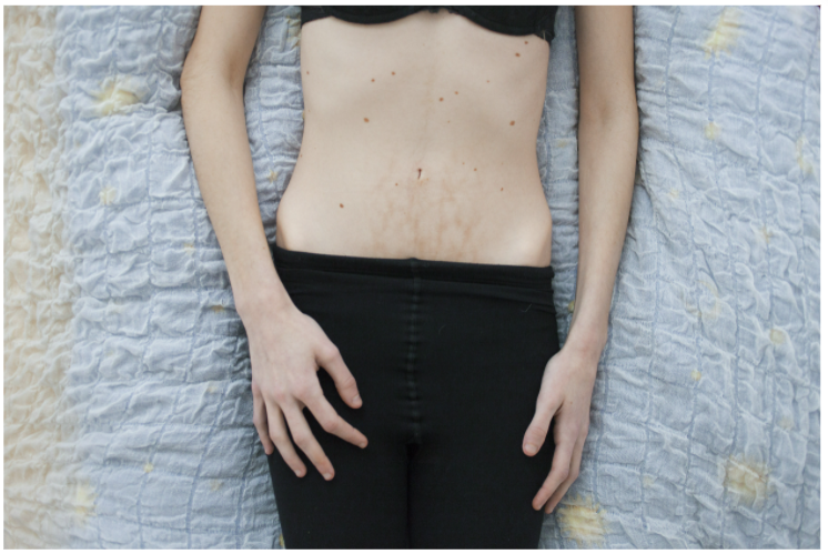
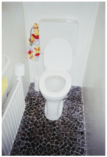
This series helped to put me on the path to my current project. Stereotypically the toilet is talked about by men not women which isn't necessarily true, so to even see it in a series shows reality as it is, Rakos hasn’t covered it up. However, in the picture to the left she’s covering herself up which is a contradiction of the toilet. These images along with Edward Honaker’s series helped to put me on the right path to my project. The bodily functions we normally keep private like having a bath or going to the toilet are now being exposed in my project and Rakos’. One thing that stood out to me was the style of each image. The left looks like a stock image, the middle looks like a self-portraiture piece and the right gives a more documentary vibe. Overall though, these work well together to tell a story of ‘approaching easting disorders.’
Krass Clement - Death 1990
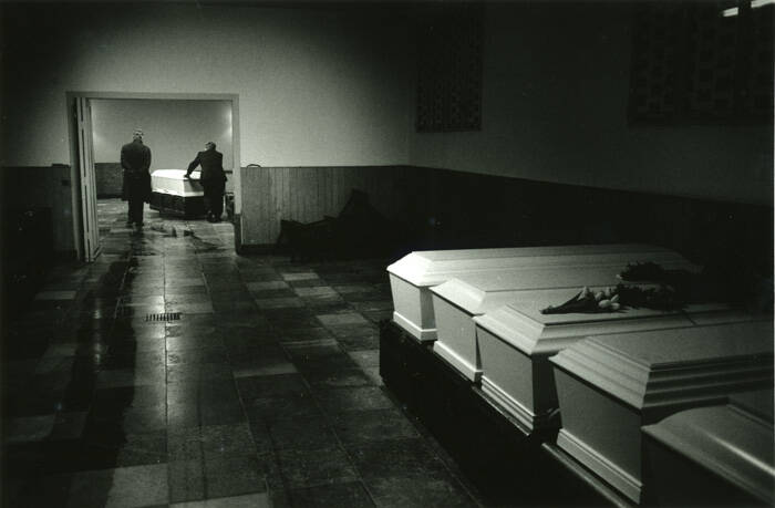
Opposed to me, Clement decided to shoot death, I want to focus on the living. But I like the way he uses his photography to show death in an image showing bodies but also by shooting what was around.
By freeze framing the coffins and paperwork, he still told the story of death without seeing it. Most of his images however are straight and to the point showing the dead bodies.
Clements uses angles that I am not used to seeing. I find his angles really make you look further into the image by exposing the parts that would normally be out of focus or smaller in the background.
Thomas Duffield - The whole house is shaking
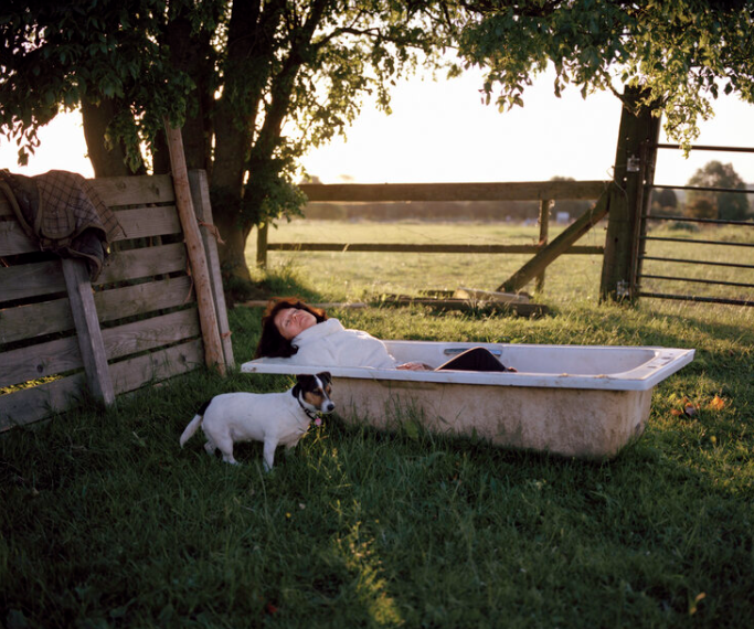
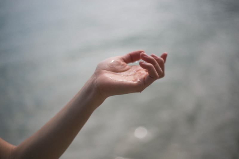
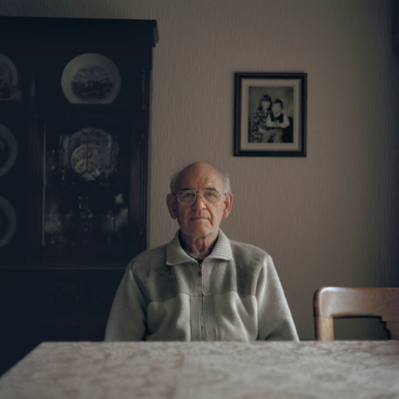
I came across Duffield’s work and his types of shots and lighting drew me in closer. This series depicts a son documenting his life living with a heroin addicted father and the secrecy surrounding it. Duffield has chosen to photograph this in a very simplistic but technical and real form. He has used natural lighting and artificial lighting to its fullest. By incorporating the two, his images look truer. His images are quite bright, and he uses some sunlight which I would suggest he shot in golden hour. The sister is taking a moment to relax in an old bath whilst enjoying the fresh air. The bath is old and possibly been thrown away, however it has taken on a new role at the bottom of the garden, providing a place of rest, peace, and tranquillity in amongst the shelter under a tree, and the company of a little Jack Russell dog.
The sister being an invisible anchor to her brother and the glue keeping the family together. The way she is lit from the sun suggests that her brother thinks of her like the angle in the family. She brings the warmth. The arm in the second image suggest it could be the sister’s arm and the water on her hand is her innocence in the story. Letting any sins or bad washing away her father’s sins. The third image to the right is the grandfather, he is set in beige tones and has a look of tiredness and unhappiness. Has he had enough…?
I was drawn to the image of his sister in the bath and her arm/hand because amongst all the heart break these images almost have hope. I wanted to bring a sense of hope into my own work. I wanted to create a realness to my series. This is why I focused on the body language.
Capella Buncher


Bunchers series, ‘And the Livin’ is Easy’ is a documentary piece on her family living in a moneyless Britain. Each family member has their own story within the bigger picture. Some of her images subtly hint to a family struggling with money and living in a lower-class situation. Looking at their faces you can see their unhappiness with their situation and the impact it is having on them mentally. It is taking its toll. Buncher uses negative space and body language to depict what she wants her viewers to envision. But also cluttered space to show the busyness of their brains. I was asked to have a look at this series for when I was stuck in isolation as it was a very similar living situation. I felt these images are very true and real and that’s what I wanted to bring to my own images. She uses light very well to highlight the emotions being felt and even though my current project is black and white I wanted to highlight emotion and body language in my own work.
Photobooks
- Drum - Krass Clement
- The Budgie Died Instantly - Nik Roche
- Girl on Girl - Charlotte Jansen
- Mastering Street Photography - Brian Lloyd Duckett
- Big Brother - Louis Quail
- Vile Bodies - Chris Townsend
- Photographers, 31 - BA(Hons) Photography: Editorial and Advertising
- INSTANT - Léo Lallemand
- MWIT - Wachirakorn Poolkerd
Mark Leslie - Dying with AIDS


Leslie's work stuck out to me because its unusual. I've never seen a book, rather a photobook before that the only text is writing. I think this is great because it really gives that personal depth and touch to the work, especially since it is a deeply emotional book. It reminds me of the Design and Technology books we would use at primary school. It reads more like a journal or a work book, which gives you a better idea of what is going on specifically. He sticks with a few sized images which keeps the consistency. His body of work gives of particular emotions and he has managed to capture those emotions well.
Sally Mann - Still Time


This book intrigues me, I think it is almost like a mini portfolio of her long standing projects. The work produced throughout is incredible. The focus and depth of field used is great. She has consistently used two image sizes, which works well throughout. This book reads to the right and too the left which I think works well and keeps the reader guessing. The top and bottom boarders throughout stay the same size and the font looks very professional and experienced.
Create Your Own Website With Webador