Feedback
Final Product - Deep Connection
https://issuu.com/jorden.jonesvines/docs/deepconnection
https://www.youtube.com/watch?v=PShDnI_voAw
https://www.youtube.com/watch?v=JavZwffap6k
https://www.youtube.com/watch?v=SpkYIpyPr7E
Issuu Upload
YouTube Flip Book Upload x2
YouTube Intermediate Drafts x2


My own Intermediate Draft Review
Throughout this process I have come along way, from my intermediate drafts. From my first draft I have decided to use black and white images as they show the raw emotion in more depth and give the images a a more beautiful esck to them. During my intermediate drafts I also had not figured out how to change the colour of the cover. So I had just left them as white. In my drafts I had on the one kept the images as a whole that were spread across to pages but then after a conversation with a publisher I decided to split the images just to make sure I didn't loose as much to the gutter. I did lay my images out on the floor numerous time which my mother and peers helped me to widdle down images to help with the layout. After a few goes I decided that I not only wanted to tell a intimate story but also the story of a having a bath.
Rachael Adams - Covid-19 Shoot 4 & 5 Feedback
Hi Jorden,
Reshoot the front door but with it open slightly so that you can see inside to make it seem like there is someone there but they are absent from the image. Shoot the grass where your mum walks, but lower down. So you can see the change of the grass within the image. (from where she is walking and where she hasn’t – the indent of her walking.) OR have her walk on the path that she has made of the grass within the lower shot photo.
Jude and Nik's Feedback on SJ BATH Shoot 1
- The images of you're mum lifting herself up from the bath could be in a sequence within you're book
- Its tricky to work out what's going on in an intimate body of work and that's what you need to define.
- Beautiful lighting shapes and forms within the images, which there is nothing wrong with and it is a way of working that is very real with layers and beauty. Can you expand on what you have produced so far. You've been very stuck inside and could you take it outside? And how would you take it outside? It could be to cold and freezing to shoot outside.
- The original bath shoot from your COVID shoot aren't in the same league, so using them isn't really a great idea.
- The intimacy between you and you're mum could be expanded a little.
- All those things you did in the bath you can make them happen outside of the bath, the closeness.
- Who else has access to you're mum like this to shoot so beautifully and respectfully.
Rachael Adams - Bookwright Preview
Hey Jorden,
Throughout this project, I’ve seen your work come together step by step, from the great parts to the parts that needing improving. I’ve seen you struggle, and I’ve seen you succeed in this module. I’ve seen when you thought it was falling apart when you thought you lost your images, and I’ve seen the excitement in your eyes when your work came together to create something, that is personal and yet so meaningful!
From the start of this module, I have seen that you have had different struggles, from contracting COVID-19 to your camera settings being out of whack! But I must say you have handle all of the problems with quick thinking and have made something which is incredible and something that shows the relationship that you have with you mum.
The front cover for me is something I’m unsure on, because for me I prefer a front cover that is simple and clean. But this image makes me think WOW. I feel like other people will think that it needs to have the title on the front of the book, but for me, if you did that it would take away from the perfection of the book. Because the image on the front is a standalone image if it had any text on it, it would take away from it. Which I am glad that you haven’t added it to it.
Having the text in the book really brings to life the narrative behind this book and set of images. I think it adds a personal touch which adds something more to the book. The book starts off really strong with the first two images, you have managed to capture your mums natural smile, and they have something about them that scream that they are not forced in any way. Which makes them peaceful, and in turn as the viewer makes me at ease.
Having the images reflected/mirrored on the page, makes you have to look at those two images, because its not something that you’d expect so it draws you into the work. There is something about the water around your mum and how comfortable she is. That is beautiful and peaceful, she seems so at peace in the water.
With the quotes from your mum, I think they are some of the most beautiful pieces of writing. Personally, I really like the images that have cropped in on parts of your mum’s body as this get me thinking about what she could be thinking whilst in the bath etc. the image at the end. All I can say is WOW.
Honestly, I know how much you have struggled with debating if your good enough, and if your work is good enough. Your work is exceptional. We all have bad days; we all have rubbish shoots. But you are an incredible photographer!
Alex Morefield - PDF Book Review
Hi Jorden,
This is an intense series of photographs of personal reflection of her relationship with her mother. You can see the trust and love between herself the photographer and her mother. The choice of font is a delicate link to the wording and the images taken of her mother naked in the bath. The choice of producing the images in Black and White heightens the sexuality and sensuality of the beauty of the narrative of the story; it's a homage to mother and daughter love. The concept of the use of water makes me think of a water birth but also the liquid protecting a child in the womb .This a beautiful book and very brave but shows the love and trust of mother and daughter. Very powerful work .
Lucy Harris - PDF Book Review
Hi Jorden,
I absolutely love the first picture of your book, very powerful. Is it the front cover, because if it is I think it would be good to have the name of the book in the top right corner. If it isn’t then ignore me. I think the second sentence of the introduction might need a bit of tweaking, there needs to be a comma in between intimate and maternal. Also not sure if the their should be a the. In the second image there is a reflection of your flash on the tiles. Might be worth trying to cop it out as it’s a little distracting. But don’t worry if you can’t because it’s not that big of a deal. The it’s in ‘it’s good to be comfortable in your own skin’ needs an apostrophe. I absolutely love the set of 3 images next to each other on the double page spread. It looks really effective and is a great way to break up the sequence. Overall, the book looks great. It is very artistic, I feel you can see your mums personality through the images, which is sometimes quite hard to see. Well done 👏
Christine Noe - PDF Book Review
Hi Jorden,
Okay, so first of all I actually really like it! It makes me really comfortable and calm looking through it. It's like you can feel how great a warm bath feels like while looking at the images. I don't have much 'negative' to say about it to be honest. If it were me I would probably have made the text a little smaller, just a few font sizes. I also think you could have left out the quotation marks, as the chosen quotes makes it really easy for the reader to understand is coming from your mum. I think the quotes are really good and match the whole story really well and provides context of who your mum is. There was a quote, I think it goes a bit like this 'my eyes tell a different story' where I was a bit unsure to what that meant. Was that a sad moment? A positive one? I couldn't really tell. But otherwise I think the quotes compliment the images so well. I also think you chose a good font for the text. It's very direct, easy to read and doesn't take your focus away from the words. So honestly, well done on the book!
Jessica Knight - PDF Book Review
Hi Jorden,
Your book looks really good! I love the front cover. The way your mum is smiling and the direct eye contact makes it feel instantly personal. Bit more inviting having her smiling as well instead of serious. We see straight away what the book is about and what the content will be like! I really like the quotes. It allows us to see more about what is going on inside your mums head (I assume it’s what she is saying) and it links well with the photos! I like the mixture of smiling and serious shots, it keeps the book interesting and not repetitive. I also like the layout how it is pretty different all throughout the book and you change it all up! Looks really nice. You’ve got so many gorgeous shots and it works really well that you’ve managed to get so many different photos when your mum is just in one place! That’s Really cool!!!! It looks really nice and you should be really proud. 😘🥰
James Wren - PDF Book Review
Hi Jorden,
The front cover of the book reflects the deeply personal story it contains. The connection of mother and daughter is emphasized by the access and story itself. A sense of comfort and connection comes across in the images between the subject and the image taker, and the text further adds to this understanding.
As a whole the work not only shows a deep connection between mother and daughter, but also makes me reflect on my own relationship with my mother. The series is deeply personal and makes me ask deeply personal questions about my own relationship with my mother. My mom's mom lost her only son when he was 33, with that in mind, and in the context of this work, I believe it helps the audience stop for a moment and consider those important to them, and the relationships they have.
Victoria Beck - PDF Book Review
Hi Jorden,
Photo number 2 (page 6) - I love the quality of the photo and I Definitely get the sense that the woman in the photo is happy and content however, I feel like there is quite a lot of negative space and the woman slightly fades to the side of the image rather than being the main focus.
Photo number 3 (page7) again I love the contrast and the image itself, really shows the different colour tones in her hair and skin. But In my opinion I feel that the photo should've been framed slightly more to the right to crop out the side of what looks like a shower screen? So then the woman and her emotions are the soul subject/object in the image.
I love the book in general however I feel like there should be 1 or 2 more photos that are closer to the woman's face and eyes so when we are looking into her eyes we can really see the emotion through her eyes.
My favourite photo is on page 48 I just love that you can really see the woman's feelings and emotions by just looking at her she seems context and safe where she sits. And there is also I feel the perfect amount of negative space with no other distractions.
If I'm completely honest I'm not sure how the story shows a connection between and mother and daughter. I get more of a vibe about how this one woman is feeling in her own skin and where she feels comfortable
Sharon Jones (Model) - Physical Book Review
Hi Jorden,
Firstly let me say I really enjoyed doing the many bath photo shoots with you, it was fun.
I was excited to see the book in its final edit, and it didn't disappoint!
I really like all the pictures and the font size is great, don't have to put reading glasses on and it's great that my mum who is partially sighted can read it. Well done, really proud of you.
My Peer Reviews
Christine Noe - Them
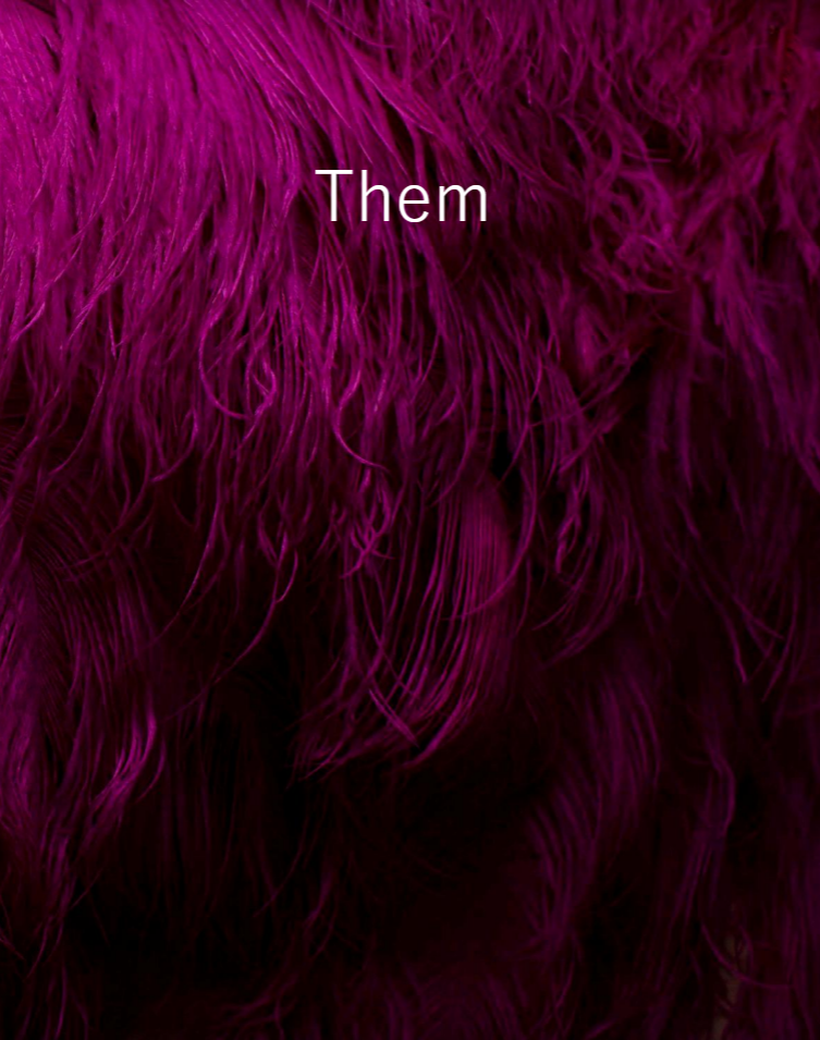

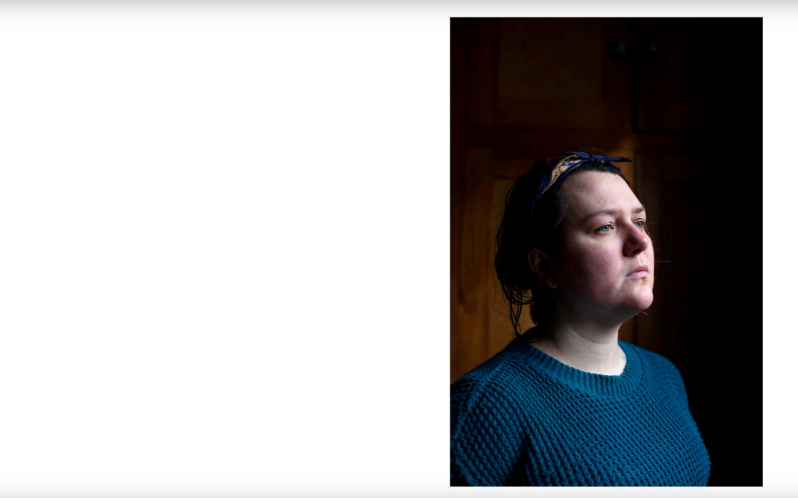
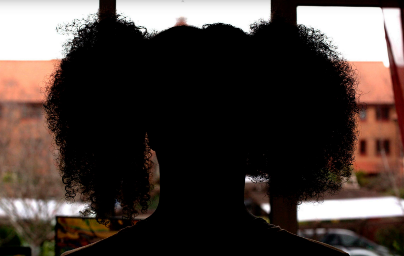
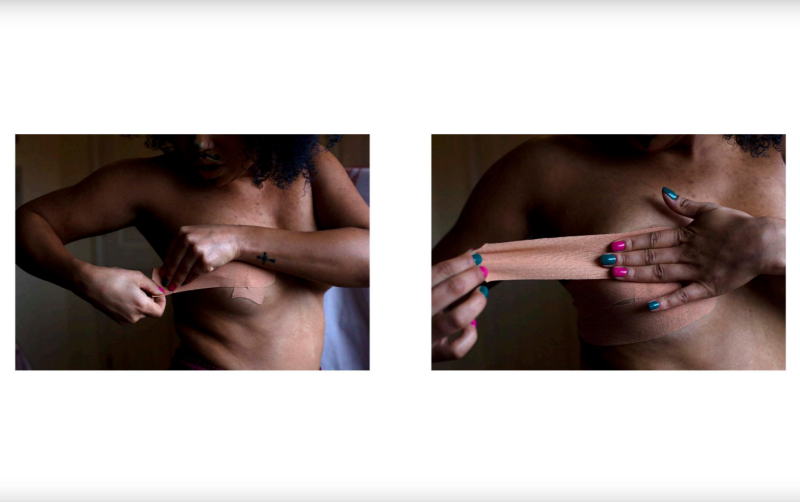
Hiya Christine,
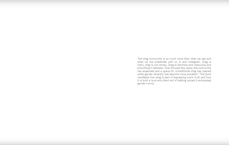
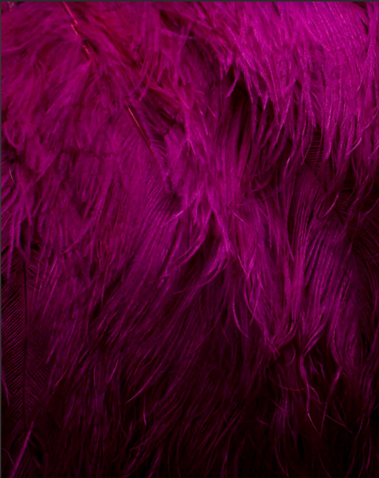
First of all I think you have created a very strong body of work which looks very experienced and professional. The layout isn't consistent which for me personally I think is great because it keeps the viewer intrigued. Your silhouette images are striking and I feel as though they almost act as your middle eight, which is great. Love the behind the scenes of the Drag community and how you have framed them. This brings a sense of realism to your work. I think the cover is very vibrant however I cant make my mind up to whether bright pink was the way to go as the common theme through your images is the colour orange. However I don't dislike it!
Rachael Adams - Heddlu


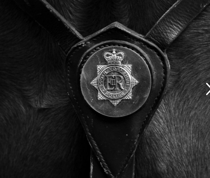

Hiya Rachael,
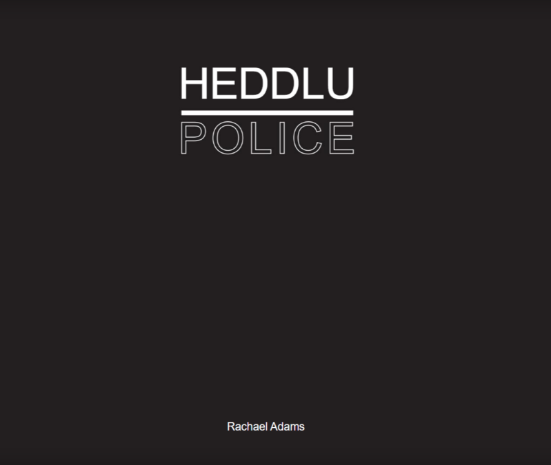
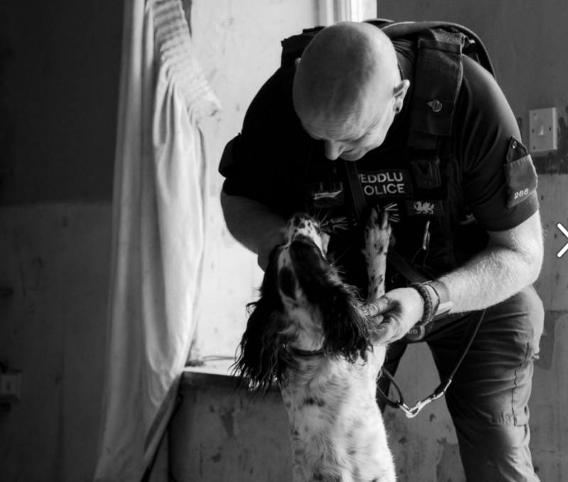
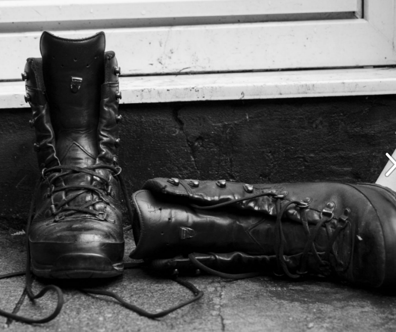
I think you have a solid front cover with a great title. However for me though it's a bit to simplistic. I think adding an image or images would have been great for enticing viewers to pick your book up. I know you had lots of doubts about your choices throughout the book but I do think you've chosen very well. I know that through the project you overcame great things, for example getting up the courage to go to Glasgow, not only on you're own but for a COP 26 conference but during a pandemic which is amazing well done and you produced some fantastic imagery from that trip. Your font is easy to read and looks very professional. I think your layout work well to tell the story of your uncle (PC Christopher Phillips and his police dogs). Having a short summary at the beginning just gives that little extra context for your readers, allowing them to delve deep into the story, which is great! I think your final layout reads lovely and especially ending on your uncle boots to show the finality of his day but also of your book. Great stuff, well done.
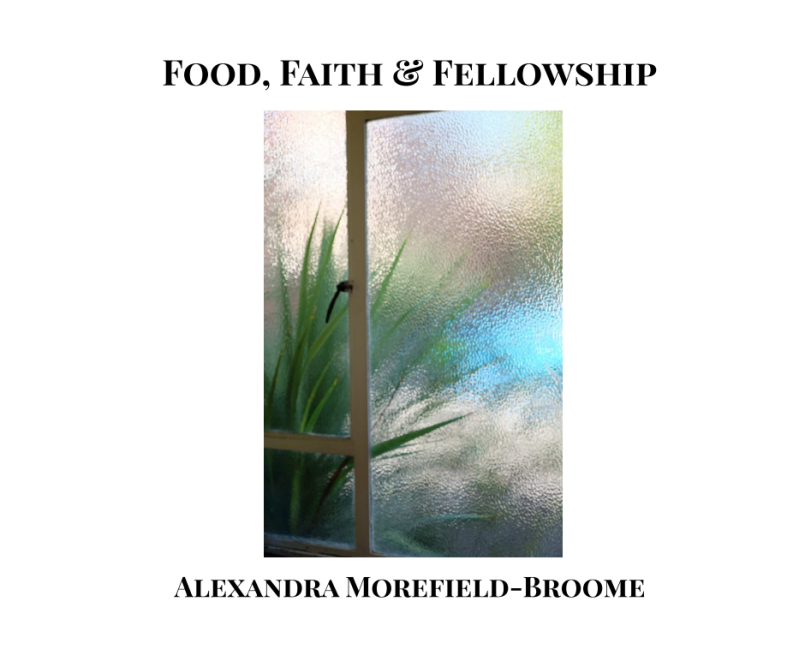
Alex Morefield-Broome - Food, Faith, Fellowship

Hiya Alex,
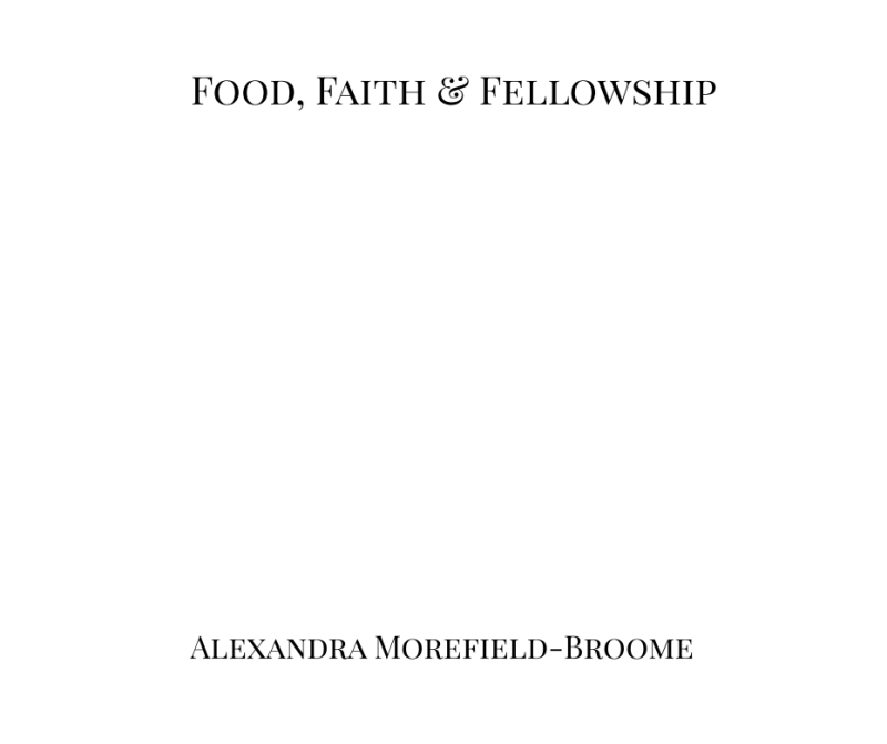
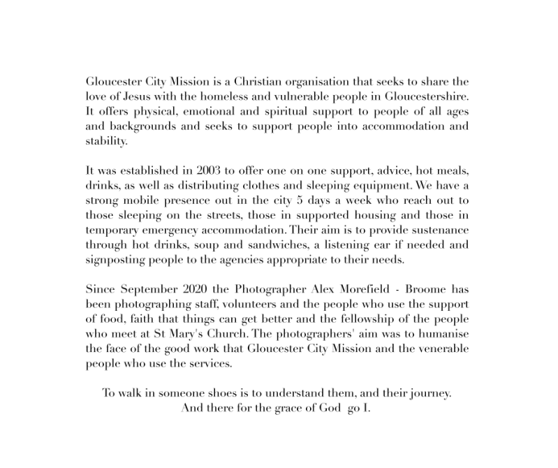
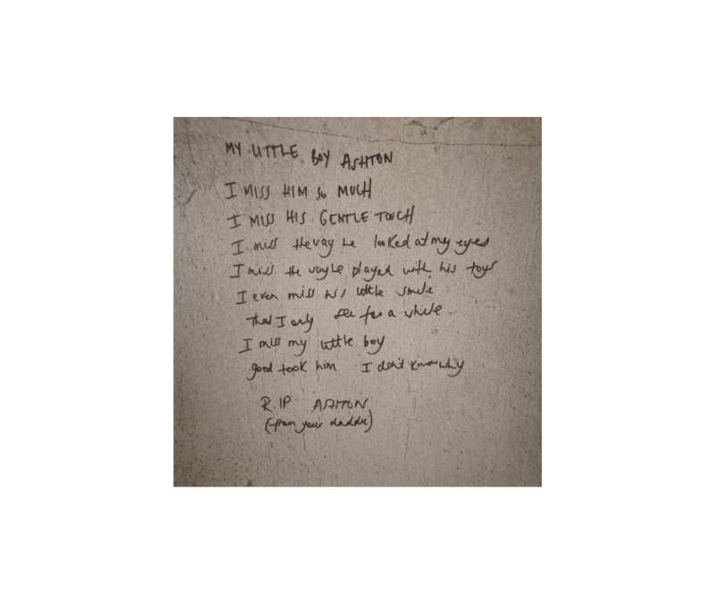
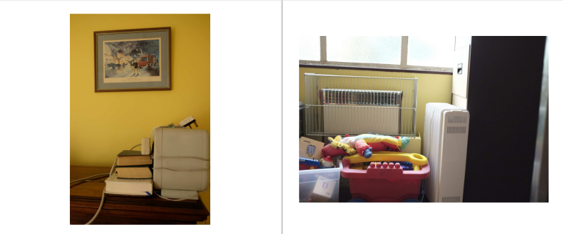
I think you have produced a very strong font for this body of work. It works well especially on you're front cover. I would of however separated your title and name in size, so you're name slightly smaller and you're font slightly bigger. Just to make it stand out a little more. I love the colours within the front cover image however I think you have much stronger images within the book which I think would have been even stronger on the front cover and then placed the current front cover image within to make sure your not loosing it as it it a great image. Fantastic first double page spread which I think sets the tone of the book well. You're extra context at the beginning is notable and gives more background for viewers to delve into. I feel the size of you're font is professional and consistent. The images in you're work are raw and show you're ability to capture moments in time, without having to edit afterwards. You have beautifully frozen the emotion of you're clients. Well done.
James Wren - 24 Hours

Hiya James,
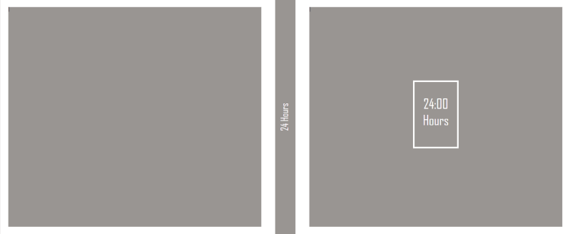
Great minimalistic cover. The white boarders gives it a pop of brightness, which is eye catching. The name 24 Hours to me symbolizes the little time we have with our loved ones and that its precious time. It shows that we are only human, we are only mortal. I think the opening image works perfectly to open the story, opening the front door into the story, into a life. Which brings me onto you're closing image of the bird box hanging from the tree and the quote, ' It will be our very own'. This is a great closing of you're book, with the doors of the bird box closing the story.
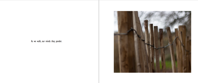
I especially love the image of the fence next to the quote, 'As we walk, our minds they ponder', I think this is a great quote! This image is shot beautifully and shows the little hidden gems we can find in our lives. The following image follows on very well, continuing to show you're viewers that our mind create odds things in random places and how we take the time to appreciate those items/things.
You're use of paths, doors, roads and boots show that in only 24 hours two people can create lots of memories and go a long way. Well done!
Create Your Own Website With Webador